
 Sandbox
 Production
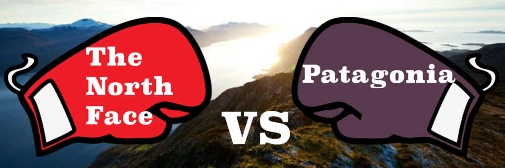
In previous Checkout Showdowns, we’ve looked at your favorite sites for binge watching tv, the most convenient convenience stores, and unofficially, we compared eCommerce furniture store Wayfair’s mobile app checkout to a mobile web experience. Our next installment is a bit more adventurous, or at least the brands are.
Both Patagonia and The North Face are high-quality, performance-gear based companies. Over the years they have grown to appeal to a diverse array of customers, ranging from hardcore outdoor enthusiasts to teen girls. The two brands’ mission statements, posted on each of their websites, happen to be strikingly similar.
Patagonia promises to, “Build the best product, cause no unnecessary harm, use business to inspire and implement solutions to the environmental crisis.”
The North Face’s pledges to, “Provide the best gear for our athletes and the modern day explorer, support the preservation of the outdoors, and inspire a global movement of exploration.”
With a shared love of the outdoors, both companies offer minimalist designs and adherence to simplicity and functionality. Let’s hope their website designs and checkout processes adhere to the same philosophy.
Patagonia
Patagonia’s site was really easy to navigate and I had no trouble finding the perfect fleece. I added one of their wildly popular Women’s fleece jackets to my cart in just a few clicks. Right off the bat, I’m liking what they have to offer. The checkout buttons are really obvious, and there is a visible place to enter a coupon code. Unfortunately, I don’t have one, but next time I’ll know to come prepared.
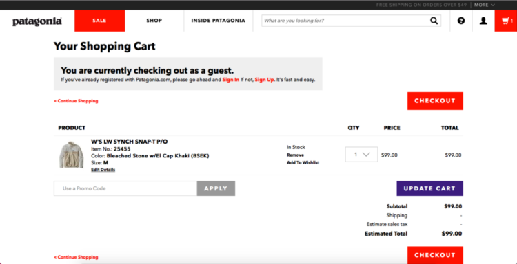
Another cool feature is that they’re letting me know I am checking out as a guest. I’m not a huge fan of brands who force me to create an account on their website simply for the purpose of checking out. So I recognize this gentle reminder to create an account, but I will continue as a guest. Hitting the top checkout box brings me to a page where I will fill out my shipping and billing information.
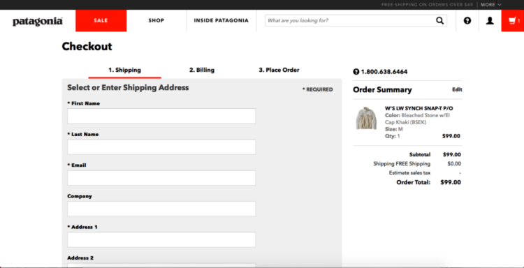
There was a decent amount of information to fill out on this page, but not so much that it was exceptionally annoying. The minimalist aesthetic also makes it easy to see and understand.
They have a shipping same as billing option which is major bonus points.
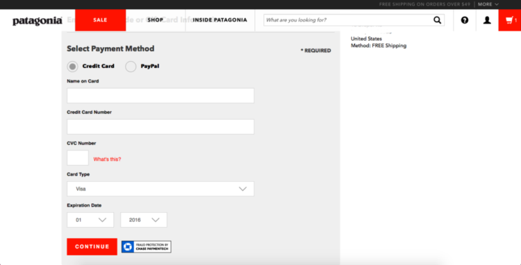
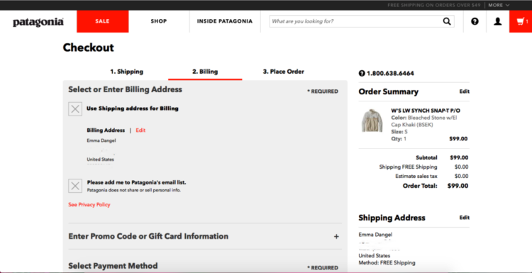
The billing page is pretty awesome. The design is simple, and the information they are asking me for here is the bare minimum. They also offer PayPal which is a good start for alternative payments, but they could definitely afford to offer more options like MasterPass or Apple Pay.
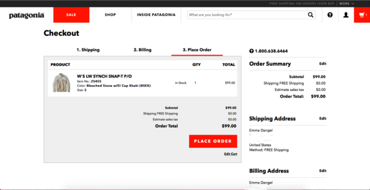
After filling in my credit card info, I’m brought to a summary page where I can verify my order. When it comes to security, I really appreciate having this last step to make sure I haven’t made any mistakes in my order, especially when something is being shipped to me.
The eye-catching place order button does a good job of directing my attention right to the finish line. Despite not having as many alternative payments types as I would like, Patagonia’s checkout proved to be well design and easy to use.
The North Face
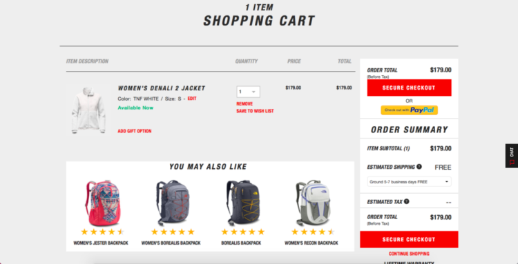
At The North Face, I began by adding one of their signature fleece jackets to my cart as well. This screen, was much more overwhelming than Patagonia’s. From an up-selling perspective they’re doing a good job of trying to get me to add more items to my cart before checkout. Personally, I find this approach rather invasive, and it complicates the otherwise simple order on the page.
While the red buttons seemed to make sense in Patagonia’s checkout, here they seem a bit more ominous. Because there is other red text on the page, it is making me wonder if something is wrong with my order. Nevertheless, I’ll continue to a secure checkout. Points here for reassuring me that this checkout would be secure.
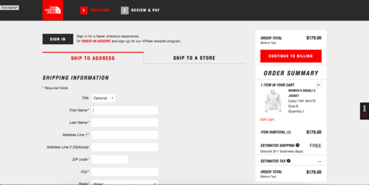
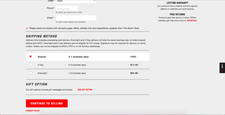
The next page consist of your standard shipping information. Interestingly, although, they include an option to “make an account” as Patagonia did, this time the box is much less conspicuous. Unlike Patagonia who made me feel bad for not signing in, The North Face is promising a faster experience and rewards for creating an account. This is much less invasive, and boasts more obvious benefits to the consumer. >
A cool feature of this checkout is that auto-fills my information after inputting the zip code, which is amazing. It will determine your city and state automatically, so I don’t have to worry about any extra scrolling or typing.
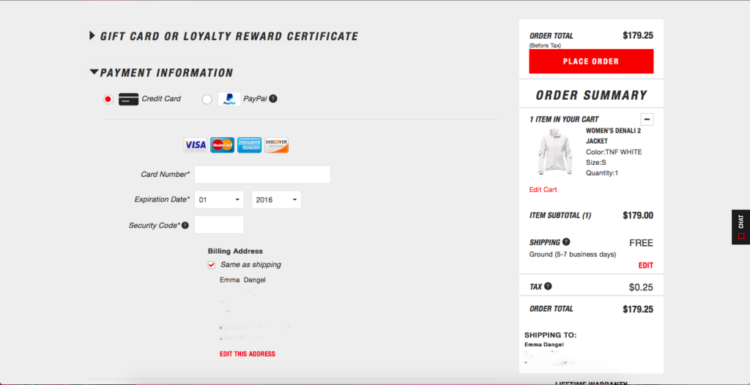
The next and final page is also quite easily navigable, with only four boxes to fill in, and again like Patagonia, a big red “place order” box to direct and encourage the buyer to complete the checkout process. The North Face is also offering credit cards and PayPal as my payment options. Unlike Patagonia who drives out to a final page to review my order, The North Face has an order summary on the same screen as my payment info, which means less clicking for me.
So who wins?
Much like their missions statements, the two checkouts here are strikingly similar. From the minimalist design to the color palette, there were times when I had to double check which site I was on. Though I didn’t enjoy the up-sell, overall, I think The North Face takes the cake here. There were less clicks to checkout, which meant more information at my disposal on each screen. The less invasive offer to sign up somewhat countered the invasive up-sell. So to the modern day explorer I say, The North Face is your best bet for an enjoyable checkout experience.