When it comes to online media streaming, Netflix and Hulu are two of the biggest players in the market. From our favorite classics to original movies and TV shows, these two media giants have forever changed the face of how we consume media. Netflix has even become a verb, and “Netflix and Chill,” a popular low-key activity. So naturally, we thought these two moguls would be a perfect matchup for the Checkout Showdown, our newest blog series comparing the checkout experience of popular brands like Walgreens and CVS.
For this installment, let’s start by looking at industry leader, Netflix.
Netflix’s Homepage
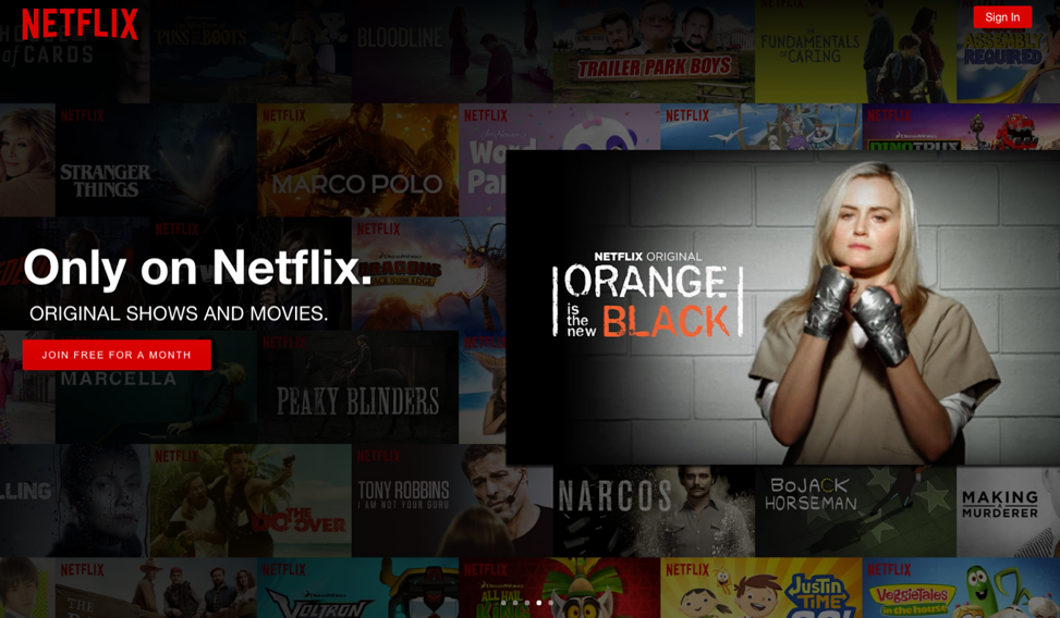
I’m already excited by the home page. First off, I’m a sucker for Orange is the New Black, so I already want to throw my money at Netflix. It’s also interesting to notice that they’re promoting Netflix Originals here, an added “hey look what we can do.” The options to Sign In and Join for Free are really obvious. Though it isn’t as obvious to recognize, when i scroll down, I can learn more about the specifics of Netflix’s offering.
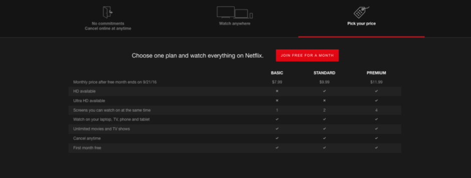
Initially, I missed this screen, but when I found it, I was really glad. I like that I can cancel anytime without a fee, and I love that they’re showing me the multiple ways I can watch. The “Pick your price” section clearly lays out the benefits of each price point, and I can start to get a sense of which subscription will make the most sense for my needs.
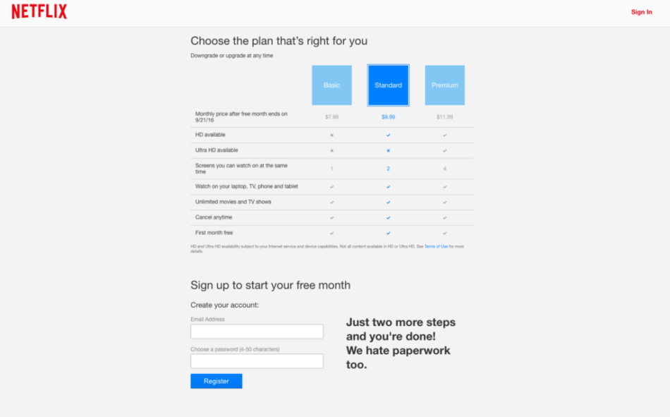
When I click on “Join For Free” I am prompted to choose the plan that’s right for me. I can choose the plan I want in terms of features but there is no discount for getting a year or two-year bundle. Whether I am a member for one month or on year, I still have the same price. Since they’ve highlighted the Standard box, it’s clear this is the plan they want me to choose.
There’s a good chance at least one of my friends will try to steal my account, so I’m going to go ahead and choose the Standard option. I’m feeling pretty good at this point about the ease of setting up my account. The interface is really clear and easy to use, though it is a bit boring.
When I go to input my email, I am reminded that I only have two steps left. Inputting my email was easy and hitting register brings me to the fun part: payments.
Netflix’s Payments Page
I love this page because they are asking me for the bare minimum of information. I gave them my email on the last screen to create an account, and now all they want is: name on card, card number, expiration date, security and zip code. I don’t have to type a billing address. And finally, I have the option between four major credit cards and PayPal, as well as the ability to pay with a Netflix gift card (in case you’re looking for some new gift ideas).
Inputting my credit card info was a breeze, but I am a bit disappointed by how much text is on the screen. The two lines of text under “Enter your payment details” are important, they remind me what I’m signing up for, but Netflix is not drawing my attention here.
All in all, checkout was simple and incredibly fast, and I can’t wait to start binge watching my favorite shows! Let’s see what Hulu has to offer.
Hulu’s Homepage
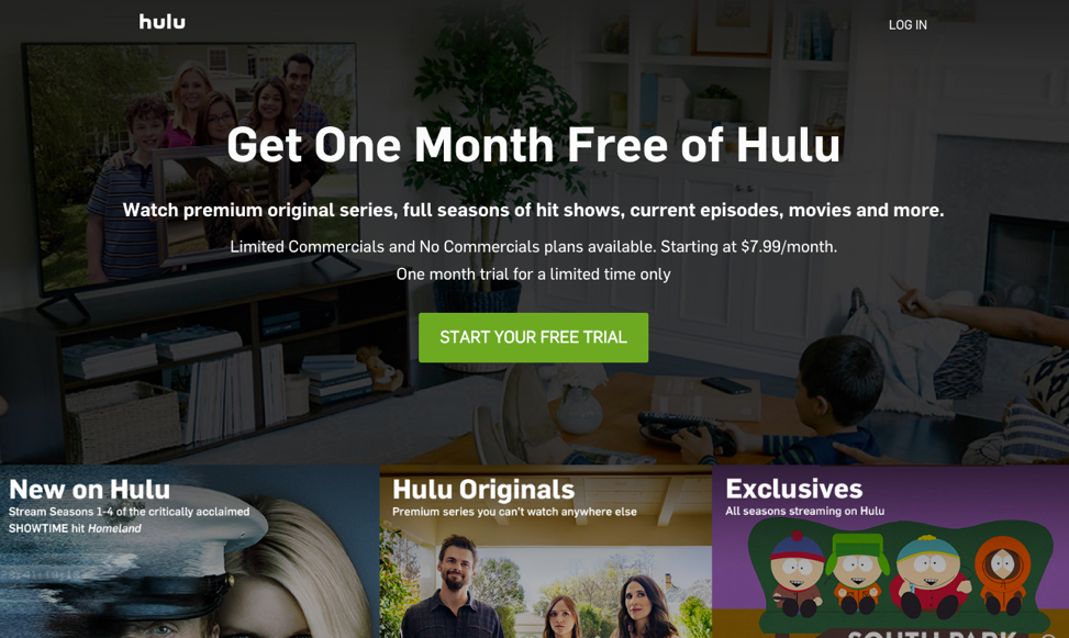
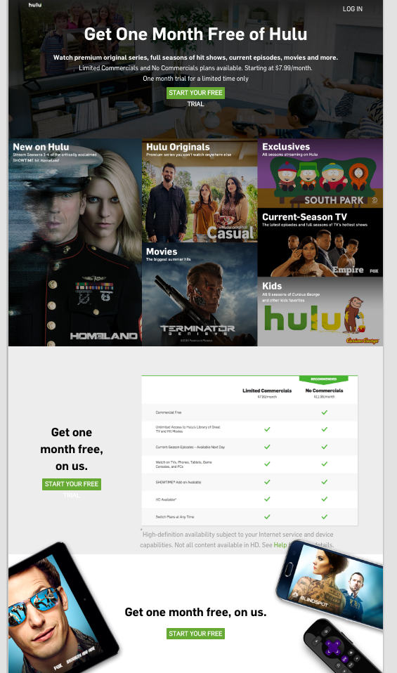
Hulu’s homepage is really visually appealing, and screams free trial. The green “Start Your Free Trial” is really prominent. Right below this, they start to promote some of their product offerings. I can choose from New, Original, and Exclusive. These are all really strong buzzwords, that already make me feel like I can be part of something important, and I haven’t even signed up yet.
Scrolling through I can see more product offerings, before I have the option to click another prominent green sign up button on the bottom
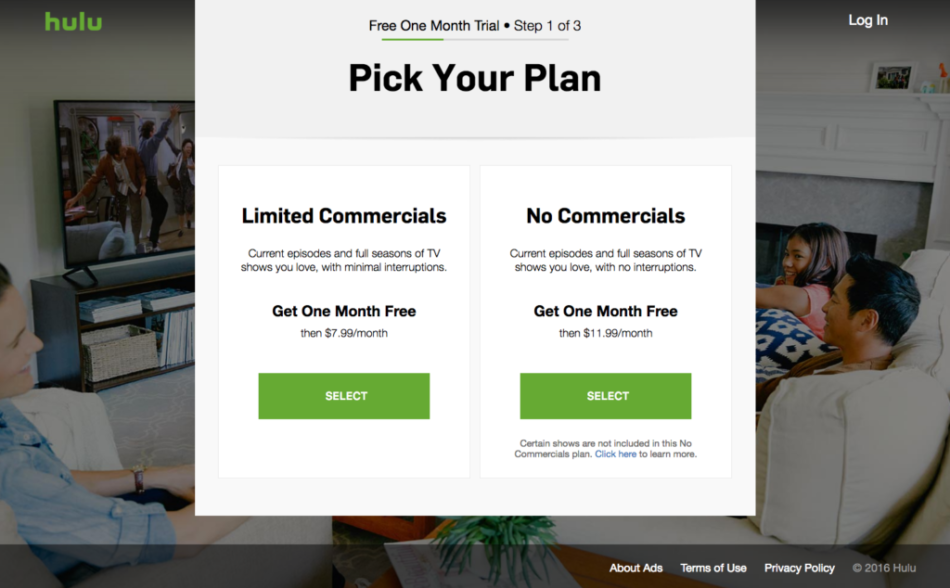
When I “Start My Free Trial” I am prompted to pick my plan. As a marketer, I do love good advertisements, but I’d rather find them on adweek on my own time, than experience an interrupted TV experience. So, I’m definitely going to choose the commercial free plan.
Things I really love about this page:
- This bar lets me know where I am in the sign up process. This is an awesome feature because it helps me to get a better sense of how much time this is going to take, and how quickly I am progressing.
- Two really clear and easy options. My biggest problem was deciding whether or not I wanted to pay an extra $4 to be free of commercials, and that was a no-brainer.
- The pricing options are similar to Netflix 7.99 and 11.99. There’s no middle ground here, but that’s okay. It’s also interesting to note that pricing difference is only commercials or no commercials, there is no upgrade of features (at least not yet)**.
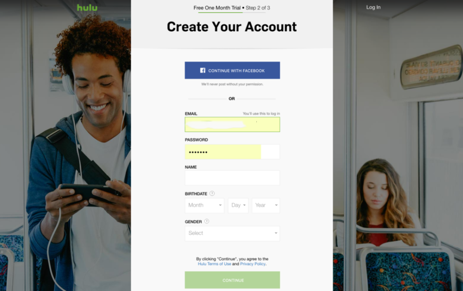
This next screen is really easy. They’re asking me for minimal information, and once I sign up, I too can be a happy Hulu bus rider!
Hulu’s Payments Page
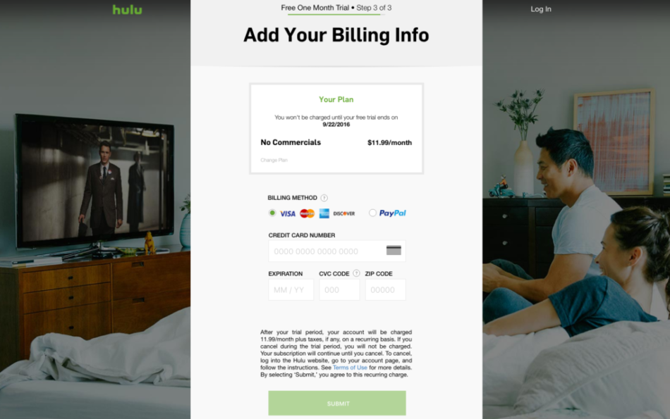
Dare I say I’m in love with this payments page? The branding here is impeccable. The relevant screen for information is white, clear, simple and EASY. But behind all this, I see a couple in bed watching the latest from James Franco, and they are loving their Hulu subscription. Here I am reminded of my plan, with an additional reminder of when my payments will officially start, and I have the option between four major credit cards, and PayPal, just like Netflix.
Once I input my info, the greyed out green button lights up, and I am good to go. One critique of this page is that they do not offer any mobile wallets. Sure they have PayPal, but what if I wanted to use Visa Checkout or MasterPass?
The Winner:
Let’s think about what both companies did well:
I really like that they’ve summarized which plan I selected and reminded me that I can cancel without penalty at any time. As someone who works in the payments industry, I also appreciate the subscription reminder. They will automatically charge me $9.99/mo and $11.99/mo without me having to take further action. This is great, because I have a lot on my mind and most certainly don’t need another bill to remember. I know Netflix and Hulu will be waiting for me whenever I need them, and I will never have a lull in service. And it’s great for them, because they know there won’t be a stop in payments. The pricing of the two companies is comparable, as were the payment options.
So who wins?
Hulu, without a doubt. Which is surprising to me, because I much prefer Netflix’s interface, playback options, product offering and general branding. But when it comes to the checkout process, Hulu blew Netflix out of the water. Their branding was impeccable and they did a really great job of highlighting the most pertinent information, and only asking me to provide the most essential personal information. Where Netflix opted for the most simplified experience, this often made for a poor experience. A green box that informs me of my progress is much more visually appealing, and easy to see, than a line of text that says almost there. Looks like Netflix is going to have to stream on when it comes to winning this matchup.


