Today’s online customers are savvy. People know how to find what they want, put the products in their cart and happily offer their personal information to purchase from a trusted site. However, too often, companies’ online checkout experiences fail customers.
Why do companies so often undo all the good work they’ve done with marketing and SEO, only to lose sales on the final checkout test? And how can you tell where your checkout experience falls on the grading scale? Years of online transactions and many studies of online shopping behavior have established a pattern for checkout that customers expect. Perhaps you need to go back to school for an evaluation.
Complete a Website Checkout Experience Self-Audit
Evaluating your entire purchase flow is the best way to conduct a complete self-audit of your entire checkout experience. Step through the process yourself from start to finish. If you have multiple checkout experiences — a few examples being checkout for physical items that require shipping versus digital items that do not — make sure you go through them all. Be sure to experience any variation of the purchase flow that customers will.
While performing the self-audit, put yourself in your cutomers’ shoes. Go into it with an open attitude and a critical eye. Remember, if you come across any little details that don’t seem right to you or are frustrating to complete, your customers will most likely feel the same.
Consider the following questions to decide if you are acing the checkout experience for your customers or if you should be looking for opportunities for extra credit:
Do you have a guest checkout option?
Traffic drops off when customers are forced to set up an account, especially if purchasing from your store for the first time. Give your visitor’s the option to checkout as a guest. While marketable data is great to gather from customers, a sale is better than nothing at all. Repeat customers will create an account eventually to speed up checkout and review past orders.
Is your checkout experience designed for mobile?
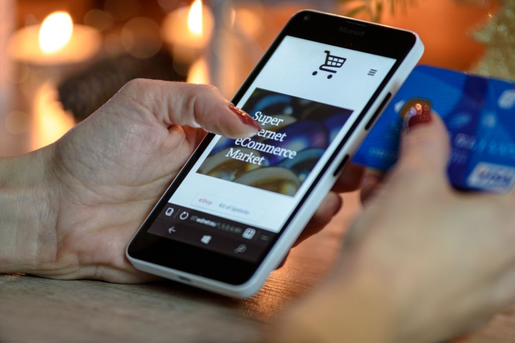
For many, mobile devices are the point of least resistance for online shopping. A huge segment of customers will make purchases solely on these devices. While most online stores offer a mobile-friendly interface, optimizations can always be made.
Just think of how YOU use your mobile device. Do you use one hand or two? Do you position icons on your home screen to make them easier to access? Research shows most people browse with one hand — moreover, people are shopping with one thumb. Make sure all essential options and buttons are within a thumb’s reach and not awkward to access.
Retailers should look at their abandonment on mobile vs. desktop. One great way to increase conversion on mobile is to offer eWallets as a payment option and display them first on the page so they are easy to click.
Do your customers know what to expect?
Tell your customer where they are in the checkout process and how much longer they’ll need to commit as they move through each step. Showing customers the steps and their current position helps to allow for a clearer user experience that converts.
Are you displaying all critical purchase information as soon as possible?
As early as you can in the checkout process, ideally even on or before the cart, show your customers as much information as possible about their upcoming purchase. The more they know, the more likely it is that they’ll continue through to checkout. At the soonest point possible, show them:
- Promo codes
- Taxes
- Shipping costs and ETAs
- Available payment options
- Clearly displayed site security
Are you surprising your shoppers with shipping costs and times?
Continuing with the previous consideration, did you know shipping costs are the most common reason for shopping cart abandonment? While everyone expects to pay taxes, the cost of shipping is an unknown that must be handled carefully. Whenever possible, tell customers before they load the cart what they should expect for shipping. Do you offer free shipping? Is shipping charged at a flat rate? Can you pre-calculate shipping costs based on the user’s location? Customers will be happiest when they know exactly what they will be paying BEFORE giving you their information.
One more point on shipping: customers LOVE free shipping. This can’t be understated. Consider marking up your products to include shipping costs, so you can then advertise “FREE SHIPPING” on every product page. If you can’t do free shipping for everything, consider a free-shipping policy once orders meet a certain total value.
Do you make customers aware of their payment options?
Simply showing payment choices using well-known brand logos carries a perception of built-in security and consumer confidence. Display these logos!
When the customer gets to the point of checkout where they need to submit payment information, a visual “lock” symbol near the payment options goes a long way in providing confidence. This iconic confirmation shows your customer that your company cares about a secure checkout.
Additionally, integrating with a payments provider that offers a variety of payment options, including popular eWallets and built-in fraud tools, and displays in local currencies and languages (if you have global shoppers) decreases friction at the checkout and instills consumer confidence in your website.
Is your site’s URL secure?
Also along the lines of security, savvy customers want to know that your site’s URL is secure before they will submit payment information to you. They will be looking for HTTPS at the beginning of your url, not HTTP. Web browsers help users recognize the good from the bad by automatically displaying a “not secure” message in the browsers address bar. A simple SSL certificate is all you need to be secure.
Do your checkout forms auto-fill when possible?
Technology is meant to make life easier, right? Simplify the checkout experience for customers by enabling auto-fill form fields wherever you can.
Some tips to do this:
- Save logged-in customer information to use for faster checkout later.
- Offer a simple checkbox to use the same address as shipping for billing.
- Only show the fields you need. If you don’t need shipping information, don’t ask for it.
- For address fields, use an address auto-complete library to make it easy. Autocomplete, which is available as part of Google Maps Javascript API, is one option.
Increase Sales with a Perfected Website Checkout Experience
These general ideas and concepts can help you increase sales by acing your website checkout experience and reducing abandonment. That said, your online store’s complexity or the products you sell might not allow for a checkout experience to be optimized so easily. If you’re in one of these industries and want to ensure that your customers are receiving the best checkout possible, a third-party UX audit by a credible eCommerce consultant might be ideal. Either way, an A-plus checkout experience will help you increase conversion rates, earn customer confidence and loyalty, and possess a competitive edge within your market segment.
Related Resources:


